Blog post formatting can make or break a blog post. Just imagine someone landed on your blog and decided to click away without even reading your blog articles. It happens to even the best of writers.
While that thought is daunting, would you feel a little better if I told you that reformatting your blog posts could increase the chances that your readers would stay a little longer to read what you wrote?
A great format can lead your reader to the oh-so-important call to action in your post from the start. This article will teach you how to blog posts with a successful format so you can get more conversions for every single post you write!

Why blog post formatting is important?
Is 15 seconds enough time for your readers to devour every word of your blog posts and sign up for your email list? I’ll make a big guess and say that no, there isn’t enough time.
Since users only spend an average of 15 seconds on a website, not only is it important that you get their attention right away, it is also crucial!
So while you’ve created the perfect headline and written quality content, if your formatting is a mess, your reader will likely get started right away before they even give your content a chance.
Having the right format for your blog posts will help your readers consume your content more easily, stay on your website longer, and ultimately convert your call-to-action!
Whether you want to get more sales or get more email subscribers, let’s talk about how the right blog post format can help you with your goals.
What makes blog post formatting different
The way we consume blog articles is different from the way we read white papers or case studies.
We love to scan when reading blog articles.
There are thousands of articles we can read from. So when we land on a blog article the first thing we do is do a quick scan to make sure the content answers our question.
Think of this as the “speed dating” of the blog world.
When your reader has done a quick scan and hasn’t been forced to read anymore, they’ll hit the back button and look for other content to read.
There is plenty of fish in the ocean when it comes to blogging. So let’s go straight to a few key areas that you can focus on in order to improve the format of your articles.
6 tips for formatting your blog posts
1. Write shorter paragraphs
If you tend to write formal documents, writing shorter paragraphs may seem alien to you at first.
Using shorter paragraphs will increase the space in your blog posts. Space is essentially the space around and between your content.
If your articles don’t have a lot of space, the content will feel tight. A lack of space usually makes it difficult for your reader to stay focused and read your entire article.
There’s no rule about how long your paragraphs should be, but 1-3 sentences are a good way to get a balanced space.
2. Perfect your writing style
Being able to determine your writing style can help keep your visitors around longer because they won’t want to stop reading.
The longer you can keep your readers interested, the more likely you are to get them to convert.
Have you ever found that you clicked article to article within a blog because of getting excited about writing?
On the other hand, I’m sure that within seconds you hit the back button too, because whatever you read, you felt like it just wasn’t written for you.
You need to understand your audience and know what they want to read.
Are you looking for something with a serious and formal tone? Or do you prefer conversation pieces with a touch of humor?
As you perfect your writing style, you can increase the number of people who choose to break the 15-second mark mentioned earlier.
3. Use the correct headings
Headings are a great way to break up your text, add more spaces, and help your reader pick up important information from your article.
Breaking your article down into proper sections with headings will give your reader a chance to do a quick scan and (hopefully) decide that your article is one they want to keep reading.
Your headings should be clear and concise and let the reader know what they will read in the following paragraphs.
Headlines aren’t just good for your reader. Search engines love them (when used correctly). So let’s take a quick crash course on semantic headers so you know whether or not you are using them properly.
For SEO purposes, search engines like you organize your headings in a certain way.
The headings are as follows:
H1
H2
H3
H4
H5
The title of your blog should always be automatically classified as an H1 heading, and you should never have more than one H1 heading on your blog posts.
If you’re blogging with WordPress, your WordPress theme should automatically apply the H1 heading to your blog titles so you don’t have to worry about it and can ignore “Heading 1”.
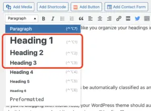
If you’re using WordPress, you can set your headings in two different places in your editor:
WordPress heading selection:

Headings give your article a hierarchical structure. For example, your first heading must always be marked as an H2 header. If you have subheadings under an H2, it must be an H3.
If you have sub-headings under an H3 heading (I think you know where I’m going with that) then you should be using an H4!
As a bonus, your headings also carry more weight than your paragraph text for SEO purposes. So try to include some of your keywords in your headings whenever possible.
4. Break up bulleted text
Bullets are useful for turning long, information-rich paragraphs into bite-sized content that your audience can read in no time.
When your readers scan, it doesn’t just highlight the contrast between the bullet points and the paragraph text, so you can make sure they’re not missing any important information.
5. Evaluate your typography and color palette
While you may not consider yourself a designer, there are a few different aspects of design that will make your blog posts more readable.
Your blog’s typography should match the fonts you have on your website. Certain fonts are great for websites while others are difficult to read.
You should also consider the size of your text. If it’s too small, your readers may click away when they have trouble reading it.
A quick and easy test is to ask someone to go to your blog and let you know if they are having trouble reading it. To qualify for insertion in Google Adsense, a 20pt font size is required to ensure good readability on mobile devices.
Below is an example of a hypothetical blog post excerpt with great typography and space. However, the other example is incredibly difficult to read. Both examples use the same passage of text, but one is much easier to collect than the other.
In addition to the font and size of your text, you should also consider the color!
Your text can easily fade into the background of your website if it isn’t high-contrast. Black text on a white background is the safest choice when it comes to contrasting colors.
People with visual impairment or color blindness may not be able to read your content if there is insufficient contrast.
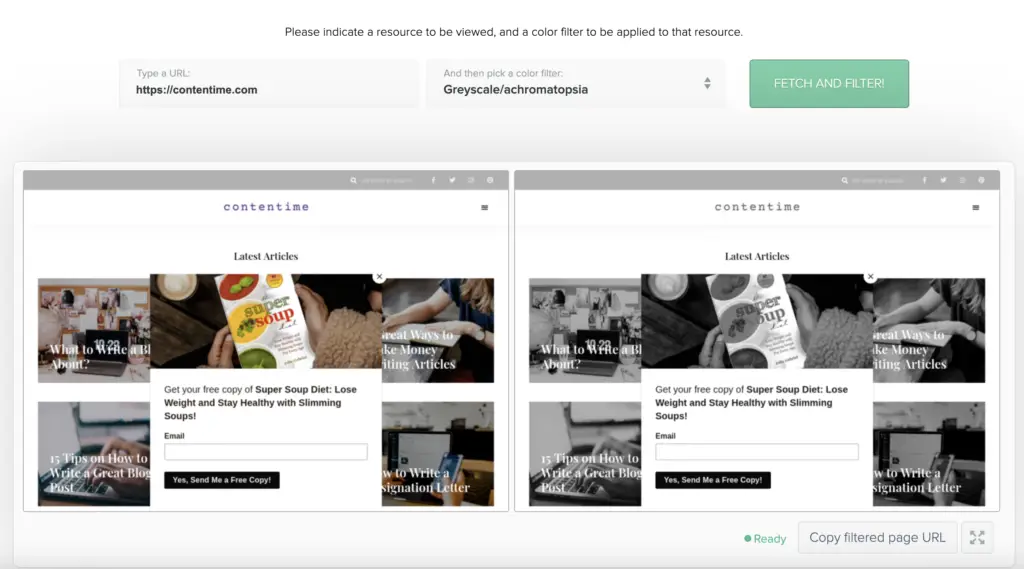
A great tool that can help you determine if the colors you’ve chosen for your blog are acceptable to all eyes is Toptal’s Colorblind website filter:

When you run your website through its filter, you can choose from different types of color blindness to see if buttons, text, or CTAs merge together.
6. Emphasize your call-to-action (CTA)
The CTA on your blog posts will take your readers to the next step.
Would you like them to sign up for your email list? Should they fill out a contact form to get in touch with you?
There are many different CTAs your blog posts can have and it is your job to make sure the CTA is clear and concise:

There will always be people who will scan your content and not fully read it, which is fine! Highlight your CTA so even those who search it can still see it and possibly take action.
Note: If there is an easy way to add CTAs to your website, be sure to check out our post on WordPress Call-to-Action Plugins.
Edit and test your blog article formatting
As you go back and edit your articles, simple mistakes can be easy to miss.
Grammarly is a great tool (with a free plan) that can act as your personal editor to help spot mistakes that you might otherwise have overlooked.
Once you’ve proofread your article, it’s almost time to hit the publish button. But not until you’ve gone through a few more tests.
You should test your content against three different ratings:
- Flesch-Kincaid Reading Ease Score
- Gunning Fog Score
- SMOG index
These different tests will help you understand if your content is too complicated for your audience by looking at the number of syllables in your words and your sentence length.
The tests mentioned will help you with this, but you should still use your best judgment. Words with more syllables aren’t always difficult words, and a longer sentence doesn’t necessarily mean it’s a start-up.
While these tests can be beneficial, they are not as helpful as if you were to get a real look at your work, which brings us to the last point.
Let someone you trust scan or do your work and see what you can get from your article in just 15 seconds.
Put yourself in the shoes of someone first landing on your article.
Are 15 seconds enough to gather important information and answer your reader’s query? Do you think you will be able to convince her to read on?
Conclusion
Improving the format of your blog posts can encourage your visitors to read more of your content and stay on your blog longer.
Using the tips above will increase the likelihood that your audience will consume the content you write and convert it into loyal readers!

